WiFi splash page examples, with notes on what each one gets right
Seven login screens for a cafe, a restaurant, a lounge, a hotel and a shop, each with a short note on its wording, fields and consent boxes. They are rendered from our demo builder, so you can make your own version of any of them in a couple of minutes.
The examples
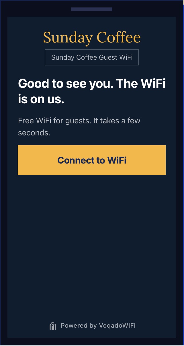
- The first screen asks for nothing. One sentence of welcome, one line on what happens, one button.
- The network name repeats under the logo, so a guest who joined the wrong network notices before typing anything.
- Gold on navy keeps the button the brightest thing on the screen, which is the only thing the guest needs to find.
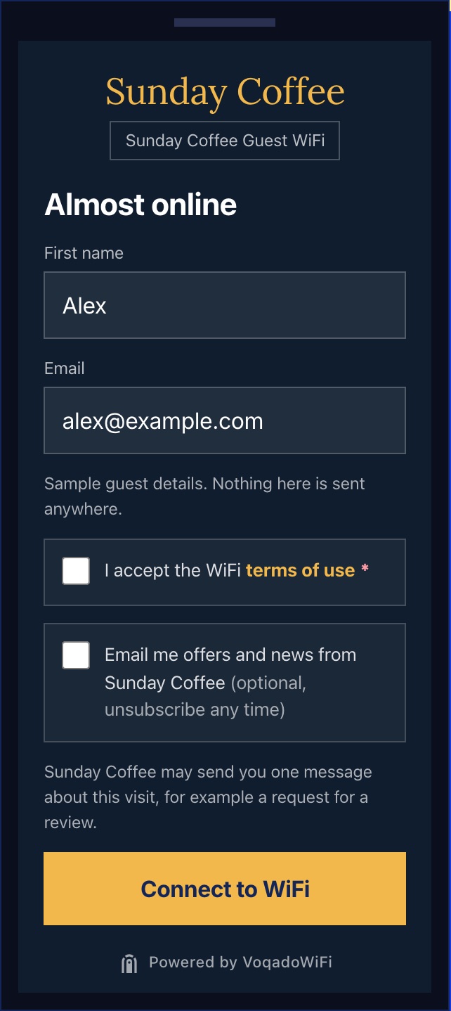
- Two fields only: first name and email. Every extra field is one more reason to give up and use mobile data.
- The WiFi terms and the marketing permission are two separate boxes. Accepting the terms gets the guest online; the marketing box is optional and starts unticked.
- The marketing box says exactly what the guest is agreeing to, in the venue’s name, and that they can unsubscribe.
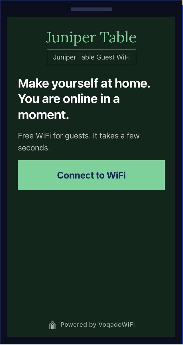
- A restaurant welcome can be warmer and slower than a cafe one; the guest is sitting down for an hour, not grabbing a coffee.
- The wording promises speed ("in a moment"), which is the guest’s real worry at a login page.
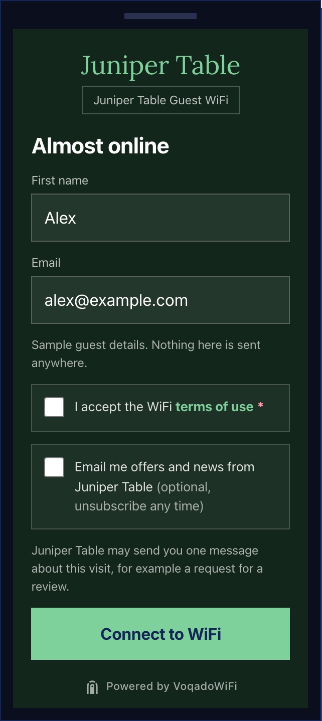
- Same structure as the cafe, different colours. The layout stays fixed so the guest always knows where the button is; the brand does the rest.
- The required star sits on the terms box only. Nothing about marketing is required.
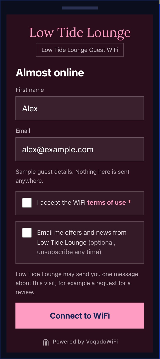
- Darker backgrounds suit evening venues and dim rooms, where a bright white login is the first thing to glare across the table.
- For bars and lounges the live portal can add an age check before this form; the demo leaves it out.
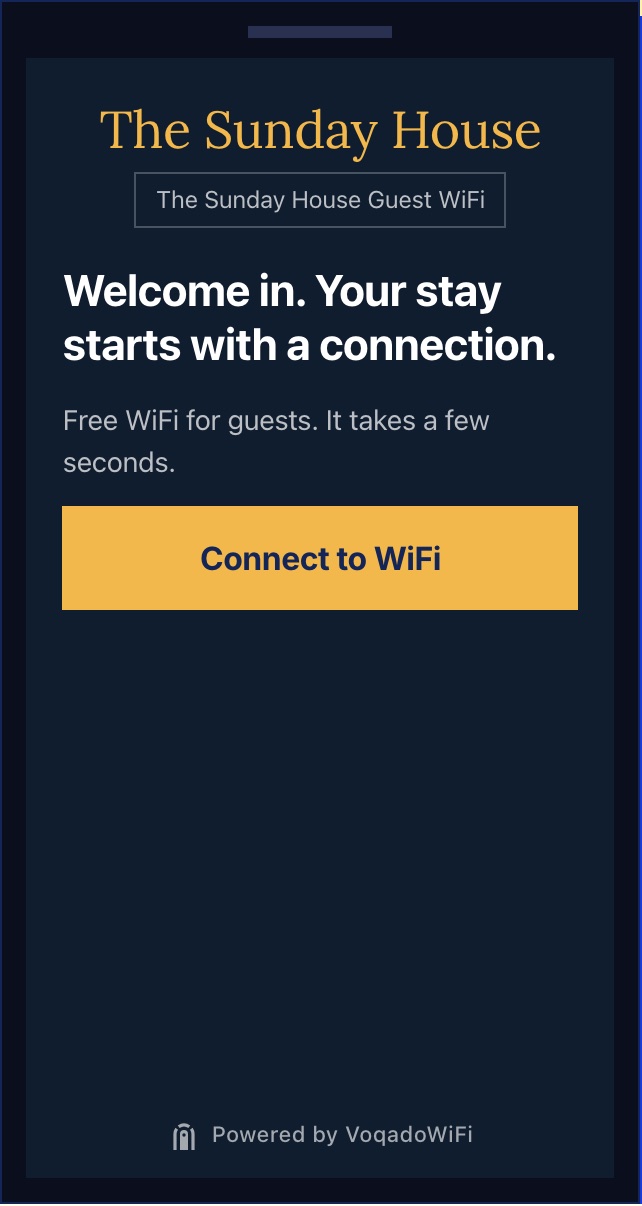
- A hotel guest connects several devices over a stay. The welcome sets the tone; returning devices are let back on without the form for the auto login period.
- After connecting, a hotel can send guests to the guest guide rather than a promotion.
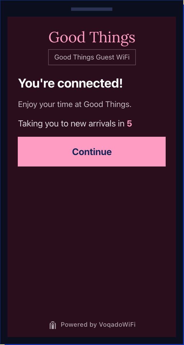
- The last screen confirms the guest is online and says where they are going next. No surprise redirects.
- A shop sends guests to new arrivals; pick the page a guest in your venue would actually want.
What all seven have in common
- One action per screen. Welcome, then the form, then confirmation. The guest never has to choose between two buttons.
- The venue name, twice. As a wordmark or logo, and in the network line underneath, so guests know they are on the right WiFi.
- Two fields. First name and email. The live login can add last name, phone or birthday per venue; none of these examples needs them.
- Consent that means something. The WiFi terms are required; the marketing box is separate, optional and unticked, and its wording names the venue.
- No advertising. The only brand on the page is the venue’s, plus a small Powered by line.
Making one for your venue
Start from your room, not a template
A cafe login is read standing at the counter in daylight. A lounge login is read in a dim room by someone holding a drink. Pick colours for where the phone will be, then check the button is still the brightest thing on the screen.
Write the welcome the way your staff talk
“Good to see you” works for a neighbourhood cafe. A hotel may prefer “Welcome in”. Keep it to one sentence: the guest wants to get online, and the welcome is there to make the wait feel like part of the visit.
Decide where guests land
The connected screen should send guests somewhere useful: the menu, the guest guide, this week’s events, new arrivals. A page they would have looked for anyway is better than a promotion they did not ask for.
For the reasoning behind each choice, read what makes a good WiFi landing page. For the words in the terms box, start from the guest WiFi terms template.
Questions
Are these real venues?
What should a WiFi splash page ask for?
Can I make one of these for my venue?
Why are the marketing and terms boxes separate?
Why is there a Powered by VoqadoWiFi line?
Keep reading
Put your own login on your WiFi, free
One location and 500 guest logins a month on the Starter plan, no card. Works with the Omada or UniFi network you already have.